Link to Facebook Group:
http://www.facebook.com/home.php?sk=group_113330418746997&ap=1
Whats The Point In Trailers?
The reason behind trailers would be so that, insitituinons can find away or grabbing their target auidences attention through them and can market their film as such to a wider audience. The effects used in these trailers grasp your attention and make you want to find out what the intial films going to be about. Trailers are much like cliff hangers which have been put into smaller content in order for you to feel like you must go and see this film.
Me being someone who watches films on a regular basis can say thaty the trailers grasp the audiences attiontion in clever ways by putting some spoliers from the actual films them self which are generally the best parts of the film. The dramatic sound effects and Mise en scene throughout the trailers give off a sensation which makes you want to go out as soon as possilbe to watch these films.
Conventions Of Trailers
Lighting - The lighting in which we used for the horror trailer tied in with the conventions of a horror trailer because we shots some clips in dark rooms to give off an eire effect. It also engulfed the victim in darkness which disabled their sight and gave the killer an upper hand for the attack the same way this would of been used in other horror trailers.
Colour - Colour was used effectively also because we stuck to the plain walls with jsut a single shade of colour so that it didnt give off any confusing significance towards the audience which guided them away from the overall thought that it was a horro trailer. These plain walls were also easy to edit and darken when it came down to the effects.
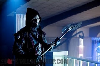
Symbols - The knife was a symbol as well because it is long and sharp this was a phallic symbol which signified power, which the lead to killer once again having an upper hand over the victims which he would soon kill. There was a lot of black clothing used in the trailer which represents darkenss creating that feelling of fatigue, where you dont know what kind of position you are in and that anything could happen at that specific moment.
Information - The information give to the audience thtought the trailer was linked if he looked at the signs the phone call at teh start. Linked with the killers past and how he changed through time showing some clips of back when he was a small child.
Mise en Scene - Within the shots we took into consideration everything within the shot having to connect with one another, the reason for this being so that our target audience could gain a clear understading of the overall plot otherwise it would have been difficult to follow along.
Themes - The themes which we chose as a group
Actors (playing characters)
The actors which ended up starring in the actual trailer...
Jordan - playing himself: He had that look which made him look innocent but at the same time lethal prove at the end
Miles - playing Jordan's Dad / Killer: Im the antagonist and being the taller one out of the group made sense for me to play the role of the dad character and killer
Sami - Jordan's Friend (Victim): Sami had a key skill in playing the vulnerable which we took in as a group and used effectivley
Robert - Jordan's Friend (Victim): Robert was good at acting and we need some extra victims in the trailer so we decided to take him in as well.
Why the choice of effects?
We chose the effects that we did for the trailer because we strongly believed that these type of effects would help add to the horror genre of the film. For example, the running blood effect that was joint with the text, blur effects and the constant flashing this type of effect would make the victim feel disorientated it would also make them feel as if they could not escape.
Research into trailers
Our group had done a vst amount of research so when it came to doing our actual trailer we were prepared to include certain convetions that other trailers had featured. Looking at trailers as such we saw that a lot of trainstions were made to build up the dramatic feel towards the end. The connections betwen the horror trailers showed that as the reailer went on the tempo gradually sped up. This could then link back to a heartbeat and when a killers closing in you heartbeats pounds faster and faster. Transitions were made to make things look out as if things were happening too fast for the human eye to catch up. Again linking back to the victim the transtions could then symbolise blinking and every transtion made is the victim itself within the trailer taking a blink and each blink draws the killer closer and closer.
The genral sounds for these trailers would be that of whispering this is deliberatly done so that you can gain a clear view of that in the trailer the people are whispering so that they done get caught as they are aware that they are in danger.
Screaming is the most common trend has it displays signs of being frightend and scared because something traumatic is about to heppen to them, slashing sounds are added addtitionally to this so that you know that something is coming and you are ready to breace youself for that moment even though within these trailers there genrally a pause so that in the end you are not prepared.
Todorov Plot
The whole idea of the trailer having a Todorov plot would be so that there are different stages in this horror trailer. At the beginning there is a State Of Equilibrium we achieved this in the trailer by showing my past experiences in my childhood life where in the trailer I was bullied.The Disequilibrium starts when a call is received by me (playing Jordan’s dad / killer) and then the first killing is made when Robert is trapped in a small room and is killed off first, this the leads onto where the Protagonist Notices Disequilibrium where in this case it is Jordan being aware of Roberts death and later on other characters.After that is where the Protagonist Attempts to Repair the Disequilibrium this is then where Jordan attempts to go up against his father; me being the killer as well and tries to kill me. Then lastly comes the New Equilibrium this is the point where Jordan walks off from him think that I am defeated and he is the only one that remains not knowing that I am still alive.
Showing posts with label School Work. Show all posts
Showing posts with label School Work. Show all posts
Monday, 16 May 2011
Friday, 1 April 2011
Media Trailer Response
My group otherwise know as 'Swagg Inc' had finished our horror trailer, we viewed it to other members of the sixth form in the lower year and gathered some feeback from it. Taking this feedback in we then used this information and developed on our trailer and made it better.
Ways in which we made it better this second time running is that we added some long clips also contatining speech in them which made an effect on the audience of building up to the intense moment of the trailer. We also edited the sound footage by fading it in to make it seem more realistic.


The pictures above are photos which were taken ourselves, we used a black and white backgrounds for these photos so that when it comes to using them for the media related work its easy to crop . The first picture was used for the poster design that was based on our trailer. The second image is the image that we used for our invitation and the third is the image used for our magazine cover.
The main source of the colours which we used were red, black and white the reason for this being because most horror film posters and magazines stick to those conventional colours e.g the red representing blood, danger and death.


To the left is the first horror magazine which my group and I created the reason for the changes would be because of the fact the positioning of the text was not positioned well which made the magazine unbalanced. the title 'HORRORSCOPE MAGAZINE' looked rough and was not at all clear from a distance, the 'MAGAZINE' part of the title also made it seem cheesey as if the audience looking to read this magazine wouldnt already know that it's a magazine.
The yellow text itself did not link back to the specific conventions of most horror film posters and did not give the magazine a good look. The main image was not large enough itself to act as a focal point in order to draw peoples attetion if they ever came across the magazine. The yellow bar at the top was a different shade of yellow completly which doesnt fit in with the yellow text at all, also the top left hand corner image did not relate to the magazine in any way shape or form so it would have been better to remove it completly.
On the right you can see the many changes which were then made to the magazine, the yellow was removed altogether. The title of the magazine was renamed to 'HORRORSCOPE' and had a bolder font used for it. The text was spread out to even out the magazine and the grey bars were removed to stop the feel as if the text was boxed off from one another. The main image was enlarged even more so now it feels as if you are being pulled in and grabbed because of the technque in which we used where the hand appears to be much upfront than the face itself and now it seems as the image is coming from the shadows with the effect used. The smaller image was also replace with a photo taken ourselves ad relates back to the horror trailer that we created and the title of the horror film trailer was enlarged as well to become more readable.


Above are the first and second attempt of the horror posters which my group and I created. From the criticism we took when we displayed our first poster to the audience who also viewed our trailer we then adapted on it and made it even better. On our first attempt at the poster you can see that the images are too far apart in order for it to be counted as a whole image, parts of the text do not stand out as they are supposed to, the date in which the film comes out is not diplayed clearly this is a main factor on a poster when you are trying to get your target audience to view your film the same goes for the website address. The age rating is not postioned in the right place on the poster; it being placed next to the title doesnt make it seem to be very clear as all the attentoin for the film up there is being drawn towards the film title.
The improvements made to this poster is that we included white text much like the magazine we stuck to the same colours and it links to the whole idea of conventions of horror film posters. The colouring of the logo was changed as well so that it fits in with the horror genre. The images are now closer together so that its the main focal point of the poster. The credit list includes all the cast and the age rating is placed at the bottom so when looking at the poster you can easly signify that the film is an age rating of fifteen as nothing along that bottom row stands out more.
Tuesday, 18 January 2011
Daddy Hell Care
Shots

.Tracking Shot
.Jay


 .Tempa T – Next Hype

 .School - The school is where the trailer is first set and where the disruption of the equilibriam starts the school contains many areas where we can focus in on for horror points and it allows us easily to connects it onwards towards the scenes inside and around the house.

Another reason for the choice of the name of the film is due to the fact that the 'Daddy' part comes across as being innocent and with a title like that you wouldn’t think of the film being a horror genre.
The 'Hell' part in the film title then allows you to realise that this is not a film for a young audience and that it is a horror genre, unlike the original film 'Daddy Day Care' which is a comedy film. We can also take some ideas off the front cover of this film and use it for our own film trailer front cover but then make a few modifications to it.


Shots
.Tracking Shot
.High Angle Shot
.Low Angle Shot
.Close Up Shot
.Establishing Shot
Characters
.Miles 

.Dannielle
.Sami
.Jordan
.Patrick
.John
.Jacob
.Jay
Music
 .Tempa T – Next Hype
.Sick Puppies - Going
down
.Saw – Theme Tune
Effects


. Flashing Shots
.Fade out
.Transition
Setting

.My (Miles's) House - Location in where the main plot of the stroy will be set and the revealing of the euqilibriam, we chose to set our trailer here because my house has a large amount of space to capture the characters in this trailer from all sorts of angles.
.School - The school is where the trailer is first set and where the disruption of the equilibriam starts the school contains many areas where we can focus in on for horror points and it allows us easily to connects it onwards towards the scenes inside and around the house.Sound
.Jack in the box
.Police siren
.Bottle smashing
.Whispering
.Screaming
.Sharpening knife
.Grudge sound
Above displays the planning in which my media group will be using in order to create our film trailer so far. It gives us a clear view in who will be involved in the media trailer, where it will be what from of music and sound will be used, the different shots that we will be using and also the number of various effects. The reason behind the choice for the title of the film would be because it relates back to the film 'Daddy Day Care' where Eddie Murphy starts as a day care work and has a dad like role.

Another reason for the choice of the name of the film is due to the fact that the 'Daddy' part comes across as being innocent and with a title like that you wouldn’t think of the film being a horror genre.
The 'Hell' part in the film title then allows you to realise that this is not a film for a young audience and that it is a horror genre, unlike the original film 'Daddy Day Care' which is a comedy film. We can also take some ideas off the front cover of this film and use it for our own film trailer front cover but then make a few modifications to it.


Me and my group have decided to generate our ideas and base our horror film on `my super psycho sweet 16' the conventions in this film include vandalised walls, blood, masked villain and dark rooms most of these conventions are popular and are noticed in many horror films. the plot of the film is about a spoiled teen, Madison Penrose's sweet sixteen is coming up. She wants to have her birthday party at the Roller-Dome, a once popular roller-rink with a violent history to match, this roller dome is the place where most of the killing happens, with its history being violent this is a typical convention used in horror films. The scene later switches to 1999; Charlie Rotter who is later revealed as the killer is the owner of a popular teen hang-out called the Roller-Dome, the home of many birthday parties. the haunted or unpleasant place in this film would be the `Roller Dome' most horror films tend to have a warehouse, church or a house in general as the haunted or unpleasant place to be where all the killing and unfortunate events take place. unlike most horror films this film doesn’t contain any religious factors or any super natural beings, the villain in this film is related to the main character, in most horror films the main character tends to have some form of relation to the bad guy.
In this film the bad guy hides his identity by wearing a hood and a mask, the hood and mask have some relation to the history of the `Roller Dome' the place where all the unfortunate events occur, seeing as he is trying to impersonate the lord of the rink a fictional being that is known to protect the `Roller Dome'.
In this film the bad guy hides his identity by wearing a hood and a mask, the hood and mask have some relation to the history of the `Roller Dome' the place where all the unfortunate events occur, seeing as he is trying to impersonate the lord of the rink a fictional being that is known to protect the `Roller Dome'.


With this horror film the conventions are pretty straight forward and simple, the main guy who is also the killer `Michael Myers' experienced something at a young age which led him to killing a family member of his, this right here is a common convention where the bad guy is forced to do the things he or she does because of a bad experience, another convention in this film is the fact that the villain is a masked person, although people know who he is he still feels the need to hide his identity. the setting of the film is in a small town although the unfortunate events and killings happen around the area where Michael Myers committed his first murder, the similarities in conventions of super psycho sweet 16 and Halloween are that the bad guy is hooded and has a mask to hide his identity and the people that are killed are related to the bad guy. the difference would have to be the setting and dialect of the films, the Halloween film is generally based around a old and damaged house, whilst in My super psycho sweet 16 is set in a posh environment.
Wednesday, 8 December 2010
Today's lesson in media
In today's lesson in media me and my group viewed a short film. This short film was produced by a group of teenagers much like ourselves in the year above.
After watching this trailer for the first time we then viewed it many more times, whilst at the same time we took down a lot of notes about the wide range of shots that were being used. From 'Close-up' shots to 'Tracking Shots'.
We then looked into further detail on the effect that it communicates with the audience and the specific type of shots that we liked and would benefit us in our upcoming trailer.
Overall in this lesson I learnt about that the wide range of 'Low Angle Shots' and 'High Angle Shots'
as well as a 'Still Frame Images' are the most effective type of shots and we all came to the idea that we will use them effectively as well in the same sort of way.
Tuesday, 7 December 2010
Current progress with our own group trailer
For our own trailer which my group and I are currently planning is horror trailer. The main story behind this trailer is that there is a child who gets bullied and comes across a poster and views a chain which catches his eye, this chain then possess's him and takes control over his body his friends try to help him in the situation and he ends up killing them and other ones close to him.
So far we have com up with a main storyboard towards this trailer, we are now going to focus on the location, setting/scenery and time. Most importantly time because making this trailer in the winter season now draws us closer to shorter days of daylight even though we want a lot of night time shots we want some daylight also. Location is second most improtant because we need to finda good area which runs well whilst we are creating our trailer. The setting/scenery is needed to be looked upon because our surrounding also playing a big role in capturing our audinece in that moment no matter whereabouts we are on the trailer a dramatic effect is neede to be set across.
So far we have com up with a main storyboard towards this trailer, we are now going to focus on the location, setting/scenery and time. Most importantly time because making this trailer in the winter season now draws us closer to shorter days of daylight even though we want a lot of night time shots we want some daylight also. Location is second most improtant because we need to finda good area which runs well whilst we are creating our trailer. The setting/scenery is needed to be looked upon because our surrounding also playing a big role in capturing our audinece in that moment no matter whereabouts we are on the trailer a dramatic effect is neede to be set across.
My Media Groups Trailer in Relation to The Omen

We have decided on a horror film for media we watched a film called 'The Omen' to relate to our trailer in order to do so we looked deep into the conventions of the horror film itself and what makes the film itself to be all that in the horror genre to be specific.
The certain aspects which we looked deep into would be that of the colours, a lot of red would be used to represnt the blood and danger to put more emphasis on the film itself. Black was another primary colour that was used it was mainly used for shadows in scary moments and to put that much more of a dramtic feel to it. Fonts displayed were also very important towards this film as they gave of a more scary approach to the film overall.
There were a lot of phallus symbols suck as the candles, spears and needles themselves this was to give off dominance and to show power in each scene, which individual character was in what position.
You could see a lot of religious symbols being used in relation to the situation itself in the film how the cross represents Jesus and towards the omen himself it was a negative response causing catastrophe when the two came together. As for lighting this was manipulated in various ways which had a posotive impact not only on the scenery but the film itself for example there were scenes where natural light would have come across as being displayed but in actual facting it was the lighting edits and added the the horror feel.
All of these main features in the film itself made us aware of good scenes which we could use in our trailer. To make sure the preliminary trailer we created using Omen cut scenes was up to standard we would use sounbites would of made sure that it included reviews, certification, billing block and one of the most important factors would be that we dont give away the ending linknig back to Todorov's theory about the equilibrium and how our trailer would show the start of the equilibrim, the disruption of the equilibrium parts of the conclusion but not the actual restoration and how it would be resolved in the end.
The speed of the trailer at points would have a great impact on the trailer itself overall, we thought as a group it would be a good idea to start off with a slow pace build up to a more vivid pace, this is good because research shows from other trailers that this is how most trailers (horror in particular) would build up as it creates a lot of tension and strong atmosphere.
Sounds that would be included in our Trailer would be those which are mainly really loud, such as booming and thunder, slashing sounds, heartbeats, screams, ticking as well as the occasional whispering sound.
A good choice of music would be that which goes from calm to fast as this creates a strong effect in relation to the images on the trailer itself. Strings are also good because it gives off a goosebump sort of feel. For onwards music afterwards rock would be a good choice because it would collaborate nicely for disruption with other edits. In my opinion I think nursey rhymes are an excellent way in which you can build up on the horror genre mainly because it gives that whole sense of innocence, chanting is similar to this but links towards rituals and their performance on people or satanic creatures.
Transitions play a key role in fitting this all together mainly because it links all different areas how flashes would flow really well with the edits and the lighting the same goes for fades and it all being in sync with the music.

The reason for us making the choices we did for this trailer would mainly be because of how other trailers which we looked at show similiar details in specific areas. The sequence was made the way we made it because the whole idea of the fonts leading into one another using transitions was very unique and thats a strong point whihc makes this trailer stand out along with the various colours used and sound effects.
What I have learned from making this trailer would be how to organise and manage my time accordingly and effectively and how to configurate 'Final Cut Pro' to structure my trailer and the right places in which to put the transtions sound effets colour and text all into one.
How I could improve upon it would have been to take into consideration most of the key facts that I had mentioned as I dont think we really looked most of them and in the long run this could benefit us and enable us to improve on other trailers in the future.
Subscribe to:
Posts (Atom)